
How to decorate with intention — Wall art, lighting and living room furniture

A room can be fully furnished and still feel like something is missing. The sofa is there, the coffee table is in place, the rug is down — and yet the space feels flat or slightly off, as though all the individual decisions haven't quite added up to a whole.
In most cases, the missing element is visual balance. Not symmetry — balance. There's a difference. Symmetry is about matching things on either side of a central point. Balance is about the way a room holds together visually, how weight is distributed across surfaces, walls and heights, and how your eye moves through the space rather than getting stuck in one corner or drawn to one awkward gap.
Wall art and lighting are the two most effective tools for creating that balance. Here's how to think about using them.
Featured collection





Understand visual weight before you hang anything

Every object in a room has visual weight — the amount of attention it draws relative to everything around it. A large, dark sofa has significant visual weight. A pale linen curtain has very little. The goal of a balanced room is to distribute that weight so no single element dominates and no corner feels abandoned.
Wall art adds visual weight to a surface that otherwise has none. A blank wall beside a large sofa creates an imbalance — the sofa pulls the eye and the wall offers nothing in return. The fix isn't necessarily a large piece of art; it's the right piece of art for that particular wall, that particular sofa and that particular room.
The Glass Picture Muse in Red is a piece that carries significant visual weight without relying on size alone. At 120 x 120 cm in laminated safety glass with a polypropylene image surface, its intensity of colour — a striking, saturated red — gives it a presence that draws the eye deliberately. This is the kind of piece you position on the wall that needs to do the most work in the room: opposite the main seating, beside a window or anchoring a dining area where the energy needs lifting.
Match the scale of art to the scale of the wall
One of the most common decorating mistakes is hanging art that is too small for the wall it's on. A small framed print on a large expanse of wall doesn't create balance — it emphasises the emptiness around it.
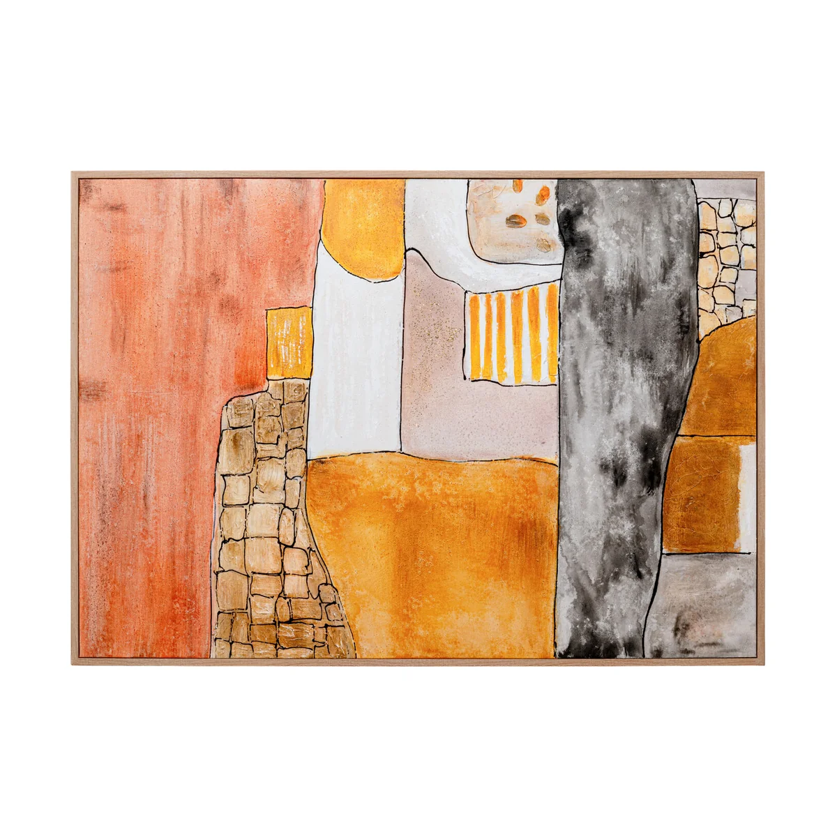
As a general rule, wall art should occupy between 60 and 75 percent of the wall space it's on, whether that's a single large piece or a curated grouping of smaller works. The Livia Framed Wall Art at 100 x 150 cm — a hand-painted canvas on a wooden stretcher with an acrylic paint surface — is genuinely large-format and earns that scale through its composition. Its multicoloured palette is balanced internally, meaning it brings movement and variety without feeling chaotic. It's the right choice for a wall that needs to carry a room rather than simply fill it.
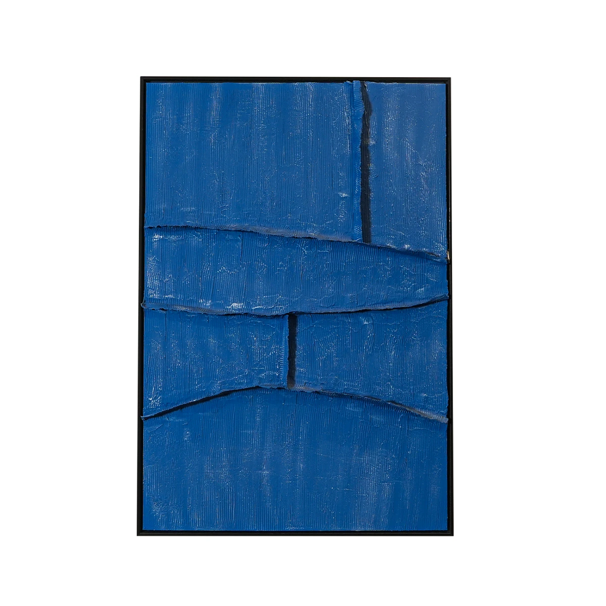
For rooms that want a quieter visual statement, the Patch Framed Picture at 100 x 140 cm in brown polyester frame offers a more restrained alternative — still substantial in scale, but softer in its impact. It works particularly well in bedrooms and reading corners where the visual language of the room is deliberately calm.
Use lighting to balance the room vertically

Most people think about balance horizontally — what's on this wall versus that wall, what's on the left side of the room versus the right. But rooms also need vertical balance: the relationship between what's happening at floor level, eye level and above.
Overhead lighting addresses the top of the room. Furniture addresses the floor. The middle — the zone between approximately 80 cm and 150 cm from the ground — is where lamps operate, and it's the zone that most rooms neglect.
A floor lamp in a corner creates a light source at standing height, which both illuminates the corner and gives the eye something to settle on in a part of the room that would otherwise be dead space. The Floor Lamp Loungy in Black is a powder-coated steel lamp at 160 cm — minimal in form, deliberately so. Its matte black finish means it reads as a graphic element in the room rather than a decorative one, which makes it particularly effective in rooms where the other furnishings are already expressive. For a softer reading of the same idea, the Floor Lamp Loungy in Beige sits back into the room rather than punctuating it.
Table lamps work at a lower register, adding light at the level where people actually spend time — seated, reading, in conversation. The Table Lamp Marleen in beige with a bouclé fabric shade and brass-plated steel accents brings texture as well as light. The bouclé shade diffuses the bulb into a soft glow that warms a room in the evening in a way that a plain white shade simply doesn't — and the material adds a tactile quality to the surface it sits on. At 60 cm tall with a 22 cm base, it's well-proportioned for a side table or console without overwhelming the surface.
Let furniture and art answer each other

A well-balanced room has a visual conversation happening between its elements. The art responds to the furniture. The lighting responds to both. This isn't about matching everything — it's about creating relationships.
A sofa with clean, contemporary lines calls for art with a similar clarity. The Picture Muse Geometry in black acrylic — with its precise geometric composition — is exactly this kind of piece. Against a sofa like the Elixir Four Seater in beige fabric, whose clean profile and neutral tone create a quiet canvas, the graphic clarity of the Geometry piece provides the contrast the room needs without disrupting the overall calm.
For a room that wants more warmth and movement, the Heather Framed Wall Art — a hand-painted multicolour canvas — brings an expressive, painterly energy that sits naturally alongside upholstered seating in richer tones. The Tobago 4 Seater Sofa in brown leather is a strong pairing here: the weight and warmth of the leather grounds the room while the hand-painted canvas gives it its personality.
A note on negative space

Not every wall needs art. Not every corner needs a lamp. Part of visual balance is knowing when to leave something alone — when the empty wall beside a doorway is doing the right thing by staying empty, or when the corner is better served by a plant than a floor lamp.
The rooms that feel most considered are rarely the most filled. They're the ones where every decision, including the decision not to add something, was deliberate.
Start with the pieces that do the most work. Build the balance around them.


